The key report this week is the May employment report on Friday.
Other key indicators include May vehicle sales, the May ISM manufacturing and non-manufacturing indexes, and the April trade deficit.
----- Monday, May 30th -----
All US markets will be closed in observance of
Memorial Day.
----- Tuesday, May 31st -----
8:30 AM ET:
Personal Income and Outlays for April. The consensus is for a 0.4% increase in personal income, and for a 0.7% increase in personal spending. And for the Core PCE price index to increase 0.2%.

9:00 AM:
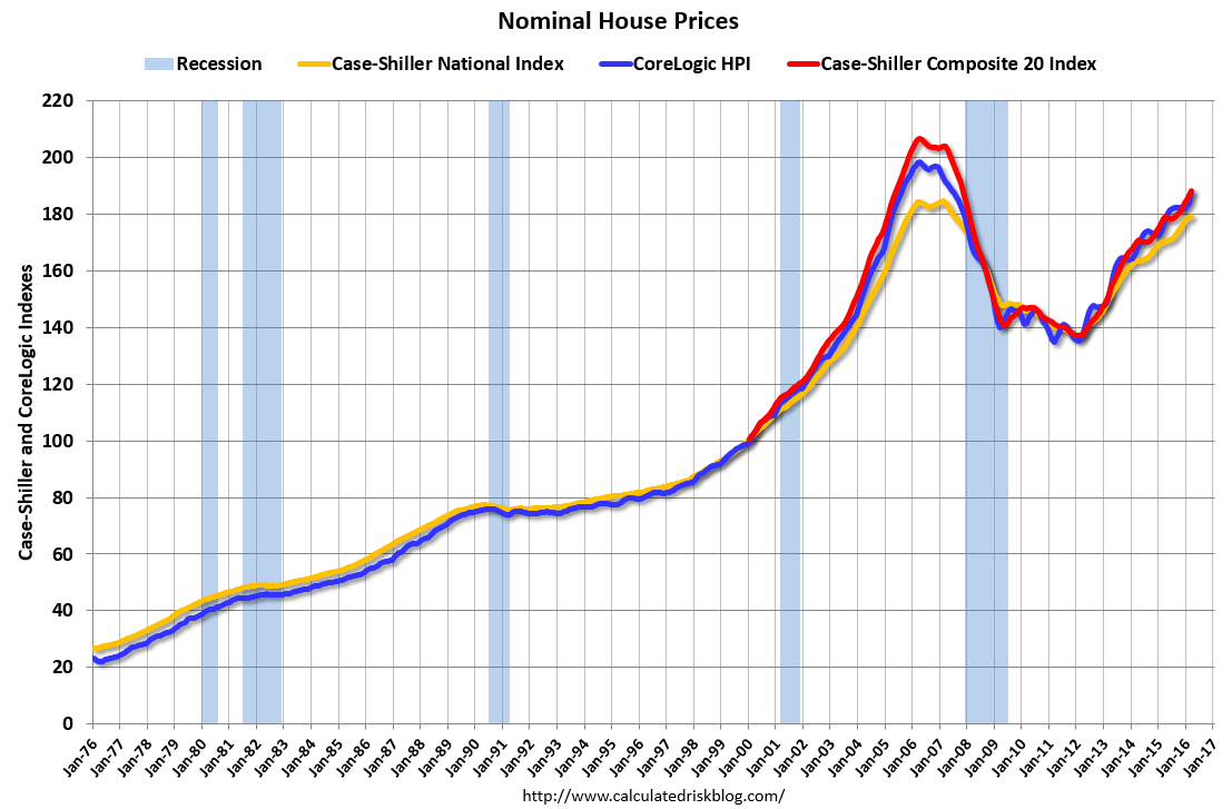
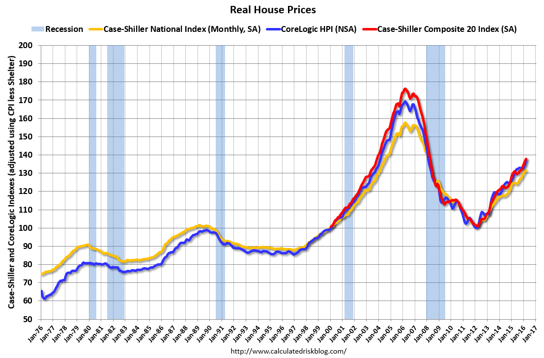
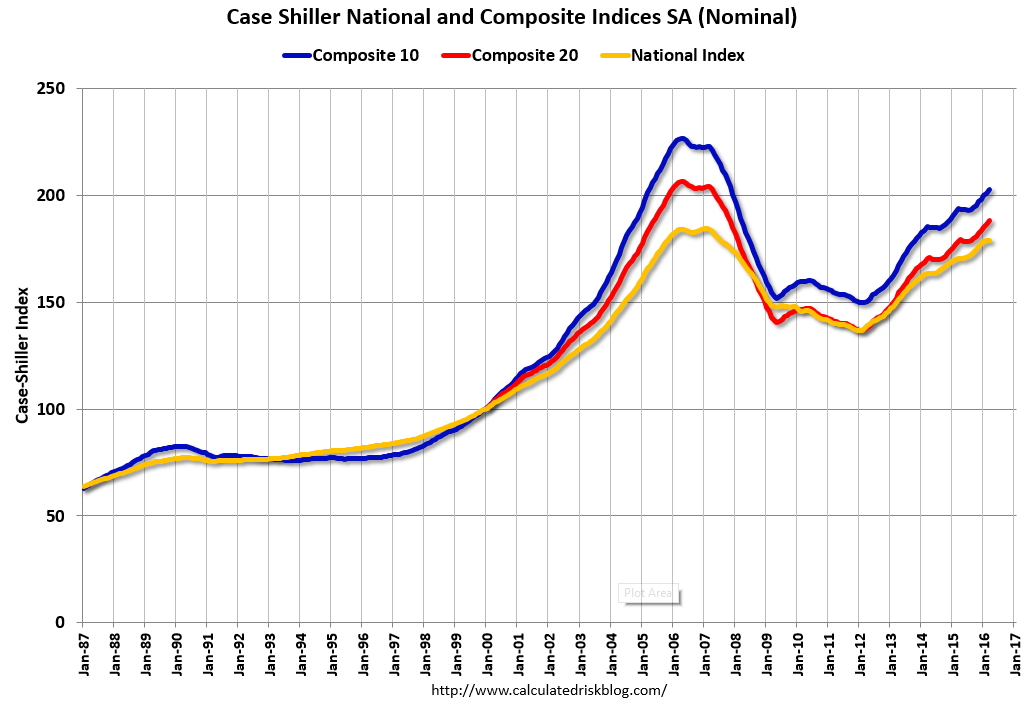
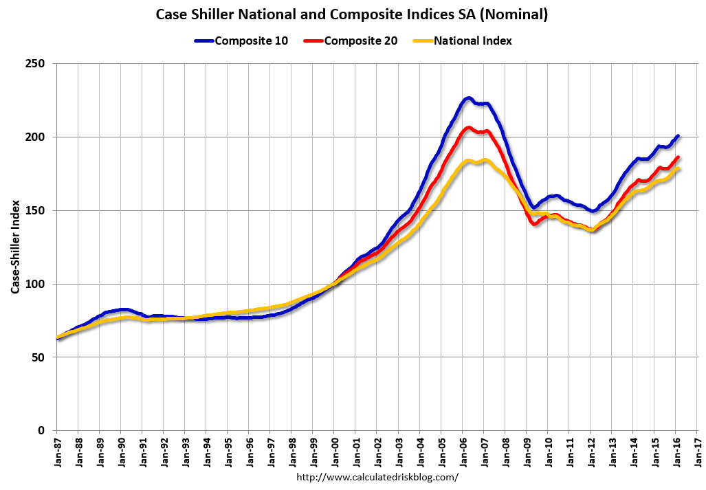
S&P/Case-Shiller House Price Index for March. Although this is the February report, it is really a 3 month average of January, February and March prices.
This graph shows the nominal seasonally adjusted National Index, Composite 10 and Composite 20 indexes through the February 2016 report (the Composite 20 was started in January 2000).
The consensus is for a 5.1% year-over-year increase in the Comp 20 index for March. The
Zillow forecast is for the National Index to increase 5.3% year-over-year in March.
9:45 AM:
Chicago Purchasing Managers Index for May. The consensus is for a reading of 50.7, up from 50.4 in April.
10:00 AM:
Dallas Fed Survey of Manufacturing Activity for May.
----- Wednesday, June 1st -----
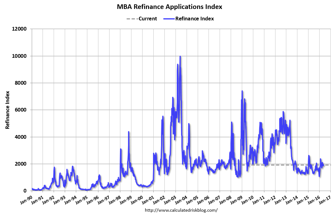
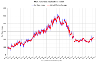
7:00 AM ET: The Mortgage Bankers Association (MBA) will release the results for the
mortgage purchase applications index.
8:15 AM: The
ADP Employment Report for May. This report is for private payrolls only (no government). The consensus is for 175,000 payroll jobs added in May, up from 156,000 added in April.

10:00 AM:
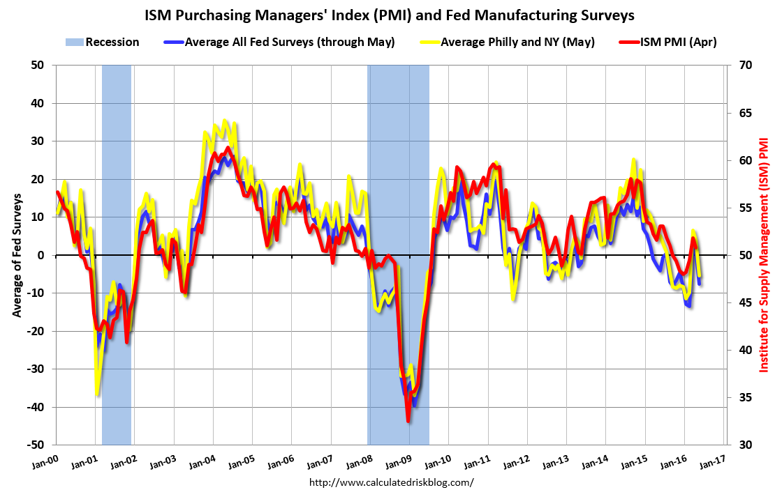
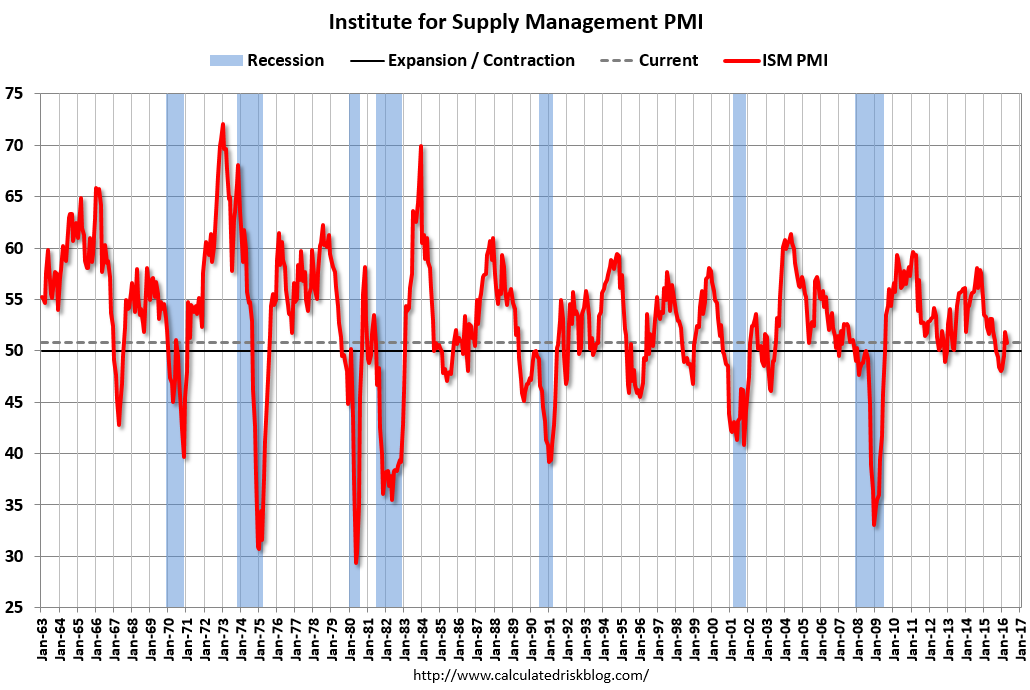
ISM Manufacturing Index for May. The consensus is for the ISM to be at 50.6, down from 50.8 in April.
Here is a long term graph of the ISM manufacturing index.
The ISM manufacturing index indicated expansion at 50.8% in April. The employment index was at 49.2%, and the new orders index was at 55.8%.
10:00 AM:
Construction Spending for April. The consensus is for a 0.6% increase in construction spending.
All day:
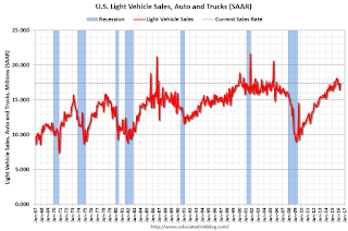
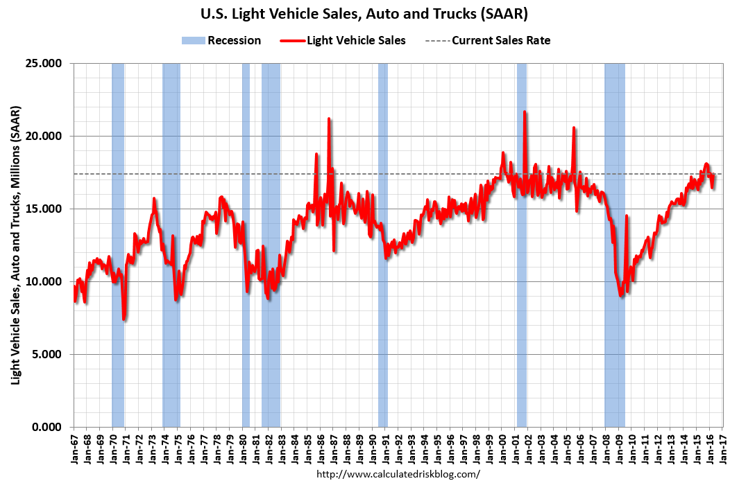
Light vehicle sales for May. The consensus is for light vehicle sales to decrease to 17.3 million SAAR in May from 17.4 million in April (Seasonally Adjusted Annual Rate).
This graph shows light vehicle sales since the BEA started keeping data in 1967. The dashed line is the April sales rate.
2:00 PM: the
Federal Reserve Beige Book, an informal review by the Federal Reserve Banks of current economic conditions in their Districts.
----- Thursday, June 2nd -----
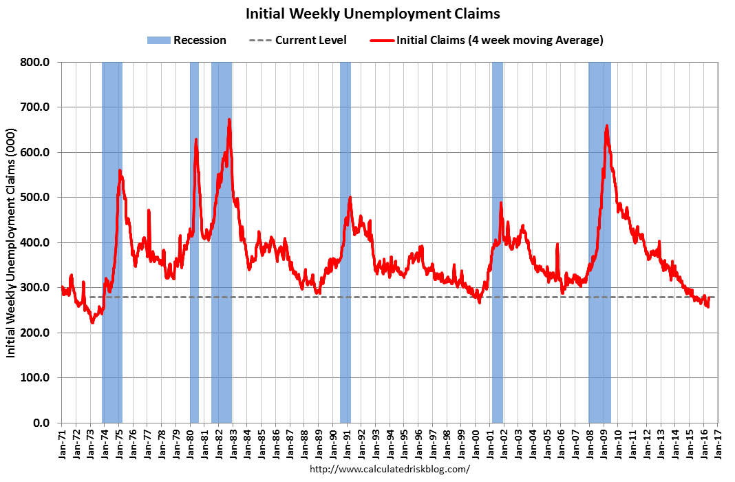
8:30 AM: The
initial weekly unemployment claims report will be released. The consensus is for 267 thousand initial claims, down from 268 thousand the previous week.
----- Friday, June 3rd -----
8:30 AM:
Employment Report for May. The consensus is for an increase of 158,000 non-farm payroll jobs added in May, down from the 160,000 non-farm payroll jobs added in April.
The consensus is for the unemployment rate to decline to 4.9%.
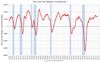
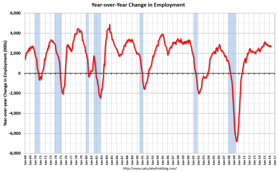
This graph shows the year-over-year change in total non-farm employment since 1968.
In April, the year-over-year change was 2.69 million jobs.
A key will be the change in wages.
8:30 AM:
Trade Balance report for April from the Census Bureau.
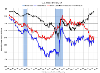
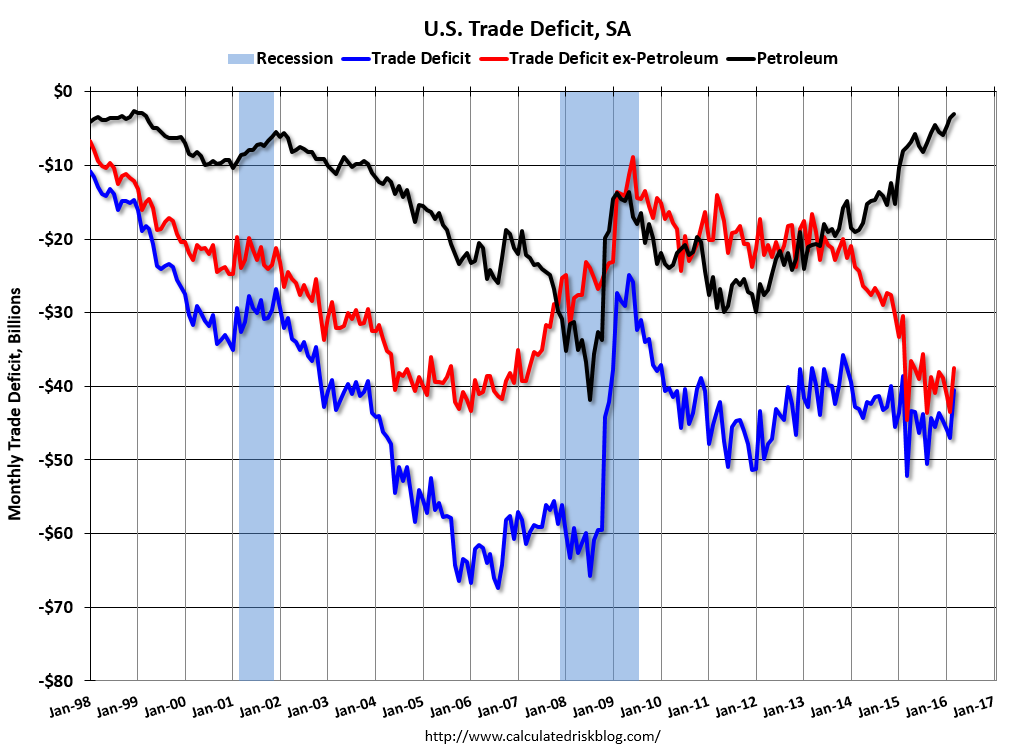
This graph shows the U.S. trade deficit, with and without petroleum, through March. The blue line is the total deficit, and the black line is the petroleum deficit, and the red line is the trade deficit ex-petroleum products.
The consensus is for the U.S. trade deficit to be at $41.0 billion in April from $40.4 billion in March.
10:00 AM: the
ISM non-Manufacturing Index for May. The consensus is for index to decrease to 55.5 from 55.7 in April.
10:00 AM:
Manufacturers' Shipments, Inventories and Orders (Factory Orders) for April. The consensus is a 2.0% increase in orders.

from
http://feedproxy.google.com/~r/CalculatedRisk/~3/CSUXRuceUiM/schedule-for-week-of-may-29-2016.html


