Wednesday, 9 November 2016

The Future is still Bright!

In January 2013 I wrote The Future's so Bright .... In that post I outlined why I was becoming more optimistic. I updated that post earlier this year (with a discussion of demographics).

For new readers: I was very bearish on the economy when I started this blog in 2005 - back then I wrote mostly about housing (see: LA Times article and more here for comments about the blog). I predicted a recession in 2007, and then I started looking for the sun in early 2009, and I've been fairly positive since then (although I expected a sluggish recovery).

I've also been optimistic about next year (2017), with most economic indicators improving - more jobs, lower unemployment rate, rising wages and much more - and with more room to run for the current expansion.   Also the demographics in the U.S. are becoming more favorable (see here for more on improving demographics).

Now Mr. Trump has been elected President.  How does that change the outlook?

In the long term, there is little or no change to the outlook.  The future is still bright!  Although I'm concerned about the impact of global warming.

In the short term, there is also no change (Mr Obama will be President until January, and it takes time for new policies to be implemented).

The intermediate term might be impacted. The general rule is don't invest based on your political views, however it is also important to look at the impact of specific policies.

I will probably disagree with most of Mr. Trump's proposals for both normative reasons (different values), and for positive reasons (because Mr. Trump rejects data that doesn't fit his view - and that is not good).

With Mr. Trump, no one knows what he will actually do.  He has said he'd "build a wall" along the border with Mexico, renegotiate all trade deals, cut taxes on high income earners, repeal Obamacare and more.   As an example, repealing the ACA - without a replacement - would lead to many millions of Americans without health insurance.  And those with preexisting conditions would be uninsurable.   This seems politically unlikely (without a replacement policy), but it is possible.

Since Trump is at war with the data (he rejects data that doesn't fit his views), I don't expect evidence based policy proposals - and that almost always means bad results.   However bad results might mean higher deficits with little return - not an economic downturn.  Until we see the actual policy proposals, it is hard to predict the impact.  I will not predict a recession just because Trump is elected.  In fact, additional infrastructure spending might give the economy a little boost over the next year or two.   On the other hand, deporting 10+ million people would probably lead to a recession.  We just have to wait and see what is enacted.

In conclusion: The future is still bright,  but there might be a storm passing through.

from
http://feedproxy.google.com/~r/CalculatedRisk/~3/wBxa3w11oa4/the-future-is-still-bright.html

Signs Your Local Real Estate Market Is A Bubble

If you were burned in 2008, the last time the housing bubble burst, you’re probably (and understandably!) gun-shy about jumping into the housing market again — especially if you think your local area could be experiencing another bubble. If you buy during a bubble, overpaying for your home, you might be forced to sell for […]

The post Signs Your Local Real Estate Market Is A Bubble appeared first on Trulia's Blog.


from
https://www.trulia.com/blog/sign-of-local-real-estate-bubble/

6 Things Home Sellers Are Legally Required To Disclose

Denise Supplee and her husband, Jerry, had been in their new home in Horsham, PA, for just three months when they started to notice something strange in their bathroom. “You could see mold starting to seep through the paint,” says Denise, a co-founder and director of operations of SparkRental.com. “We had a contractor come in […]

The post 6 Things Home Sellers Are Legally Required To Disclose appeared first on Trulia's Blog.


from
https://www.trulia.com/blog/legally-include-sellers-disclosure/

Leading Index for Commercial Real Estate "moves higher" in October

Note: This index is a leading indicator for new non-residential Commercial Real Estate (CRE) investment, except manufacturing.

From Dodge Data & Analytics: Dodge Momentum Index Moves Higher in October
The Dodge Momentum Index grew 4.1% in October to 133.6 from its revised September reading of 128.3 (2000=100). The Momentum Index is a monthly measure of the first (or initial) report for nonresidential building projects in planning, which have been shown to lead construction spending for nonresidential buildings by a full year. October’s gain nearly reversed the loss in September, and returns the Momentum Index to the rising trend that began earlier in the year. The commercial component of the Momentum Index rose 6.1% in October, and is 20% above last year. This suggests that despite being in a more mature phase of the building cycle, commercial construction has room for further growth in the coming months. The institutional component of the Momentum Index increased 1.4% in the month, and is now 10% higher than one year ago.
emphasis added
Dodge Momentum Index Click on graph for larger image.

This graph shows the Dodge Momentum Index since 2002. The index was at 133.6 in October, up from 128.3 in September.

According to Dodge, this index leads "construction spending for nonresidential buildings by a full year". In general, this suggests further increases in CRE spending over the next year.

from
http://feedproxy.google.com/~r/CalculatedRisk/~3/Cumqv7baxu0/leading-index-for-commercial-real.html

Phoenix Real Estate in October: Sales up 13%, Inventory up 1% YoY

This is a key housing market to follow since Phoenix saw a large bubble / bust followed by strong investor buying.

Inventory was up 1.0% year-over-year in October.  This was the eighth consecutive month with a YoY increase in inventory, following fifteen consecutive months of YoY declines in Phoenix.

The Arizona Regional Multiple Listing Service (ARMLS) reports (table below):

1) Overall sales in October were up 12.6% year-over-year.

2) Cash Sales (frequently investors) were down to 21.0% of total sales.

3) Active inventory is now up 1.0% year-over-year.  

More inventory (a theme in 2014) - and less investor buying - suggested price increases would slow sharply in 2014.  And prices increases did slow in 2014, only increasing 2.4% according to Case-Shiller.

In 2015, with falling inventory, prices increased a little faster -  Prices were up 6.3% in 2015 according to Case-Shiller.

Now inventory is increasing a little again, and - if this trend continues in Phoenix - price increases will probably slow in Phoenix.    According to Case-Shiller, prices in Phoenix are up 2.7% through August (about a 4.0% annual rate) - slower than in 2015.

October Residential Sales and Inventory, Greater Phoenix Area, ARMLS
  Sales YoY
Change
Sales
Cash
Sales
Percent
Cash
Active
Inventory
YoY
Change
Inventory
Oct-08 5,384 --- 1,348 25.0% 55,7031 ---
Oct-09 8,121 50.8% 2,688 33.1% 39,312 -29.4%
Oct-10 6,591 -18.8% 2,800 42.5% 45,252 15.1%
Oct-11 7,561 14.7% 3,336 44.1% 27,266 -39.7%
Oct-12 7,020 -7.2% 3,081 43.9% 22,702 -16.7%
Oct-13 6,038 -14.0% 1,910 31.6% 26,267 15.7%
Oct-14 6,186 2.5% 1,712 27.7% 27,760 5.7%
Oct-15 6,308 2.0% 1,570 24.9% 24,702 -11.0%
Oct-16 7,102 12.6% 1,494 21.0% 24,950 1.0%
1 October 2008 probably includes pending listings


from
http://feedproxy.google.com/~r/CalculatedRisk/~3/q2T5zpoa0Mk/phoenix-real-estate-in-october-sales-up.html

MBA: "Mortgage Applications Decrease in Latest MBA Weekly Survey"

From the MBA: Mortgage Applications Decrease in Latest MBA Weekly Survey
Mortgage applications decreased 1.2 percent from one week earlier, according to data from the Mortgage Bankers Association’s (MBA) Weekly Mortgage Applications Survey for the week ending November 4, 2016.

... The Refinance Index decreased 3 percent from the previous week to its lowest level since May 2016. The seasonally adjusted Purchase Index increased 1 percent from one week earlier. The unadjusted Purchase Index decreased 1 percent compared with the previous week and was 11 percent higher than the same week one year ago.
...
The average contract interest rate for 30-year fixed-rate mortgages with conforming loan balances ($417,000 or less) increased to its highest level since June 2016, 3.77 percent, from 3.75 percent, with points increasing to 0.38 from 0.36 (including the origination fee) for 80 percent loan-to-value ratio (LTV) loans.
emphasis added
Mortgage Refinance Index Click on graph for larger image.


The first graph shows the refinance index since 1990.

Refinance activity increased this year since rates declined, however, since rates are up a little recently, refinance activity has declined a little.


Mortgage Purchase IndexThe second graph shows the MBA mortgage purchase index.

The purchase index was "11 percent higher than the same week one year ago".

from
http://feedproxy.google.com/~r/CalculatedRisk/~3/eDcfmLAWsAg/mba-mortgage-applications-decrease-in_9.html

Tuesday, 8 November 2016

Lawler: Selected Operating Statistics from Large Publicly Traded Home Builders

From housing economist Tom Lawler:

Below is a table showing selected operating results of large publicly-traded builders for the quarter ended September 30, 2016.

In aggregate these seven large builders showed combined net home orders of 24,648 last quarter, up 8.4% from the comparable quarter of 2015. Sales per community for these combined builders last quarter were up 6.6% YOY, reflecting very slow growth in the number of active communities.

In stark contrast to these builders’ results, the Census Bureaus’s preliminary estimate of new single-family home sales for the third quarter of 2016 was 147,000 (not seasonally adjusted), up 23.5% from the comparable quarter of 2015.

There are many reasons, of course for large builder results to differ from Census estimates. First, of course, is that market shares can change significantly. Second, Census treats sales cancellations differently than builders do in their financial. Third, the geographic “footprint” of these large builders does not reflect that of the US as a whole. And finally, there may be timing differences between when builders “recognize” a sale and when a sale shows up the Census’ Survey of Construction.

Having said that, however, the latest quarterly results of these large builders shows unusually slow growth relative to the growth in Census’ estimate of new SF home sales. Given that preliminary Census home sales estimates are often revised significantly, in part because Census must “guesstimate” sales of homes for which a permit has not yet been issued, I believe there is a better-than-even change that third-quarter new home sales as estimate by the Census Bureau will be revised downward in the next monthly release.

  Net Orders Settlements Average Closing
Price (000s)
Qtr. Ended: 9/16 9/15 % Chg 9/16 9/15 % Chg 9/16 9/15 % Chg
D.R. Horton 8,744 8,477 3.1% 12,247 10,576 15.8% $297 289 2.9%
PulteGroup 4,775 4,092 16.7% 5,037 4,356 15.6% $374 336 11.3%
NVR 3,477 3,258 6.7% 3,922 3,607 8.7% $484 469 3.2%
CalAtlantic* 3,531 3,238 9.0% 3,680 3,231 13.9% $452 411 10.0%
Meritage Homes 1,737 1,567 10.8% 1,800 1,712 5.1% $409 387 5.7%
MDC Holdings 1,296 1,109 16.9% 1,293 1,080 19.7% $445 421 5.7%
M/I Homes 1,088 988 10.1% 1,148 994 15.5% $365 341 7.1%
SubTotal 24,648 22,729 8.4% 29,127 25,556 14.0% $371 $352 5.5%

*Note: CalAtlantic was formed with the merger of Standard Pacific and Ryland, completed in October 2015. The Q3/2015 statistics for CalAtlantic are pro forma statistics for Standard Pacific and Ryland combined

from
http://feedproxy.google.com/~r/CalculatedRisk/~3/PcQFnUvbOgk/lawler-selected-operating-statistics.html

7 Homes For Rent That Belong In A Harry Potter Movie

When it comes to creating places that capture the imagination, J.K. Rowling wrote the book — make that books. And with the November 18 film premiere of Fantastic Beasts and Where to Find Them, the Harry Potter author-turned-screenwriter will invite Potterheads to delve into a whole new world of witchcraft and wizardry as magical monsters […]

The post 7 Homes For Rent That Belong In A Harry Potter Movie appeared first on Trulia's Blog.


from
https://www.trulia.com/blog/homes-for-rent-that-belong-in-a-harry-potter-movie/

Las Vegas Real Estate in October: Sales up 5.5% YoY, Inventory down Sharply

This is a key distressed market to follow since Las Vegas has seen the largest price decline of any of the Case-Shiller composite 20 cities.

The Greater Las Vegas Association of Realtors reported Southern Nevada Housing Market Cools Down in October, GLVAR Housing Statistics for October 2016
The Greater Las Vegas Association of REALTORS® (GLVAR) reported Tuesday that the local housing supply remains tight as Southern Nevada home prices and sales cooled a bit from previous months but remain ahead of last year’s levels.
...
According to GLVAR, the total number of existing local homes, condominiums and townhomes sold in October was 3,225. That was down slightly from September, but up 5.5 percent from 3,057 one year ago. Compared to the same month one year ago, 6.7 percent more homes, and 6.1 percent more condos and townhomes sold in October.
...
By the end of October, GLVAR reported 7,693 single-family homes listed for sale without any sort of offer. That’s down 29.7 percent from one year ago. For condos and townhomes, the 1,245 properties listed without offers in October represented a 45.8 percent decrease from one year ago.
emphasis added
1) Overall sales were up 5.5% year-over-year.

2) Active inventory (single-family and condos) is down sharply from a year ago (A very sharp decline in condo inventory).

from
http://feedproxy.google.com/~r/CalculatedRisk/~3/AvACrbD_sns/las-vegas-real-estate-in-october-sales.html

BLS: Job Openings increased slightly in September

From the BLS: Job Openings and Labor Turnover Summary
The number of job openings was little changed at 5.5 million on the last business day of September, the U.S. Bureau of Labor Statistics reported today. Hires edged down to 5.1 million and total separations was little changed at 4.9 million. ...
...
The number of quits was little changed in September at 3.1 million. The quits rate was 2.1 percent. Over the month, the number of quits was little changed for total private, and increased for government (+36,000).
emphasis added
The following graph shows job openings (yellow line), hires (dark blue), Layoff, Discharges and other (red column), and Quits (light blue column) from the JOLTS.

This series started in December 2000.

Note: The difference between JOLTS hires and separations is similar to the CES (payroll survey) net jobs headline numbers. This report is for September, the most recent employment report was for October.

Job Openings and Labor Turnover Survey Click on graph for larger image.


Note that hires (dark blue) and total separations (red and light blue columns stacked) are pretty close each month. This is a measure of labor market turnover.  When the blue line is above the two stacked columns, the economy is adding net jobs - when it is below the columns, the economy is losing jobs.

Jobs openings decreased in September to 5.486 million from 5.453 million in August.

The number of job openings (yellow) are up 2% year-over-year.

Quits are up 12% year-over-year. These are voluntary separations. (see light blue columns at bottom of graph for trend for "quits").

This is another solid report.

from
http://feedproxy.google.com/~r/CalculatedRisk/~3/G3R5egnW77E/bls-job-openings-increased-slightly-in.html

NFIB: Small Business Optimism Index increases in October

From the National Federation of Independent Business (NFIB): October 2016 Report: Small Business Economic Trends
The Index of Small Business Optimism rose 0.8 points to 94.9, still in the 94 range that has bound it for the past five months and well below the 42 year average of 98.
...
Fifty-five percent reported hiring or trying to hire (down 3 points), but 48 percent reported few or no qualified applicants for the positions they were trying to fill. Twenty-eight percent of all owners reported job openings they could not fill in the current period, up 4 points. This indicates that labor markets remain tight and the unemployment rate will remain steady at what many call “full employment”
emphasis added
Small Business Optimism Index Click on graph for larger image.

This graph shows the small business optimism index since 1986.

The index increased to 94.9 in October.

This is the highest level this year.

from
http://feedproxy.google.com/~r/CalculatedRisk/~3/av_pWmoaURA/nfib-small-business-optimism-index.html

Monday, 7 November 2016

Tuesday: Election Day, Job Openings

A few truths: Trump lies repeatedly, he knows nothing about economics, and he is a disgusting person (his comments were not locker room comments). And his threat to jail his political opponent will be discussed and criticized for centuries.

Back in May, I wrote A Comment on Litmus Test Moments. I gave an example of some litmus test moments (issues that will come back and haunt people if they were on the wrong side - like the housing bubble). I argued that rejecting Trump will be a "litmus test" in the future.

Send a message to the future! It is important that Trump loses and loses badly. You will feel better about yourself in a few years when you can honestly say you didn't vote for Trump.  It will be even better if you can point to a public post opposing Trump written before the election (twitter, Facebook, blog, etc).  You will thank me later.

Tuesday:
• At 6:00 AM ET, NFIB Small Business Optimism Index for October.

• At 10:00 AM, Job Openings and Labor Turnover Survey for September from the BLS. Jobs openings decreased in August to 5.443 million from 5.831 million in July. The number of job openings were up 3% year-over-year, and Quits were up 4% year-over-year.

• All day, U.S. Presidential Election. The forecasts of all key analysts and economists assume Ms. Clinton will be the next President (my forecasts also assume a Clinton presidency). So if Trump is elected, expect some market volatility as forecasts are revised.

A beautiful story ...


from
http://feedproxy.google.com/~r/CalculatedRisk/~3/XxQTlGmySfo/tuesday-election-day-job-openings.html

Fed Letter: "Has the Fed Fallen behind the Curve This Year?"

From Fernanda Nechio and Glenn D. Rudebusch at the San Francisco Fed: Has the Fed Fallen behind the Curve This Year?
Last December, monetary policy analysts inside and outside the Fed expected several increases in short-term interest rates this year. Indeed, the median federal funds rate projection in December 2015 by Federal Open Market Committee (FOMC) participants was consistent with four ¼ percentage point hikes in 2016. So far, none of those increases has taken place.

Of course, monetary policy decisions are often described as data-dependent, so as economic conditions change, FOMC projections for the appropriate path of monetary policy adjusts in response. However, as Rudebusch and Williams (2008) note, changes in forward policy guidance can confound observers and whipsaw investors. In fact, some have complained that the lower path for the funds rate this year represents an inexplicable deviation from past policy norms. A reporter described these complaints to Federal Reserve Chair Janet Yellen at the most recent FOMC press conference (Board of Governors 2016b): “Madam Chair, critics of the Federal Reserve have said that you look for any excuse not to hike, that the goalpost constantly moves.” Such critics have accused the Fed of reacting to transitory, episodic factors, such as financial market volatility, in a manner very different from past systematic Fed policy responses to underlying economic fundamentals.

This Economic Letter examines whether the recent revision to the FOMC’s projection of appropriate monetary policy in 2016 can be viewed as a reasonable course correction consistent with past FOMC behavior. We first show that the projected funds rate revision is not large relative to historical forecast errors. Next, we show that a simple interest rate rule that summarizes past Fed policy can account for this year’s revision to the funds rate projection based on recent changes to the FOMC’s assessment of economic conditions.
And the conclusion:
The downward shift to the FOMC’s 2016 funds rate projection was not large by historical standards and appears consistent with past Fed policy behavior in response to evolving economic fundamentals. Therefore, if monetary policy was correctly calibrated at the end of last year, it likely remains so, and the Fed has not fallen behind the curve this year.


from
http://feedproxy.google.com/~r/CalculatedRisk/~3/QQbX0KVz7PA/fed-letter-has-fed-fallen-behind-curve.html

Want To Be Financially Secure? Buy A House

Taking the leap into homeownership — whether you’re considering a home for sale in Austin, TX, or Tampa, FL — can be daunting when you’re used to renting. From house hunting to making an offer to gathering pertinent paperwork, it’s a much more complex process than signing a lease agreement. But while easier financial approval and less […]

The post Want To Be Financially Secure? Buy A House appeared first on Trulia's Blog.


from
https://www.trulia.com/blog/buying-your-first-home-for-financial-security/

Fed Survey: "Banks reported stronger demand for most categories of RRE home-purchase loans"

From the Federal Reserve: The October 2016 Senior Loan Officer Opinion Survey on Bank Lending Practices
Regarding loans to businesses, the October survey results indicated that, on balance, banks left their standards on commercial and industrial (C&I) loans basically unchanged while tightening standards on commercial real estate (CRE) loans over the third quarter of 2016. Regarding the demand for C&I loans, a modest net fraction of domestic banks reported weaker demand from large and middle-market firms, while demand from small firms was little changed, on balance. Regarding the demand for CRE loans, a moderate net fraction of banks reported stronger demand for construction and land development loans, while demand for loans secured by multifamily residential and nonfarm nonresidential properties remained basically unchanged on net.
...
Regarding loans to households, moderate net fractions of banks reported easing standards on loans eligible for purchase by government-sponsored enterprises (known as GSE-eligible mortgage loans), and modest net fractions of banks reported easing standards on loans categorized as QM jumbo and QM non-jumbo, non-GSE-eligible residential mortgages. The remaining categories of home-purchase loans were little changed on net. Banks also reported that demand for most types of home-purchase loans strengthened over the third quarter on net. Regarding consumer loans, on balance, banks indicated that changes in standards on consumer loans remained basically unchanged, while demand for auto and credit card loans rose.
...
On net, domestic survey respondents generally indicated that their lending standards for CRE loans of all types tightened during the third quarter.6 In particular, a moderate net fraction of banks reported tightening standards for loans secured by nonfarm nonresidential properties, whereas significant net fractions of banks reported tightening standards for construction and land development loans and loans secured by multifamily residential properties.

Regarding the demand for CRE loans, a moderate net fraction of banks reported stronger demand for construction and land development loans, while demand for loans secured by multifamily residential and nonfarm nonresidential properties remained basically unchanged on net.
...
During the third quarter, a moderate net fraction of banks reported having eased standards on GSE-eligible loans, while modest net fractions reported easing standards on mortgage loans categorized as QM non-jumbo, non-GSE-eligible residential and QM jumbo residential mortgages. Meanwhile, banks left their lending standards basically unchanged for all other categories of residential real estate (RRE) home-purchase loans on net.

Over the third quarter, banks reported stronger demand for most categories of RRE home-purchase loans except for government and subprime residential mortgages. In particular, significant net fractions of banks reported stronger demand for GSE-eligible residential mortgages. Moderate net fractions of banks reported stronger demand for QM non-jumbo, non-GSE-eligible, QM jumbo, non-QM jumbo, and non-QM non-jumbo residential mortgages. emphasis added


from
http://feedproxy.google.com/~r/CalculatedRisk/~3/UVjj7T0g-UE/fed-survey-banks-reported-stronger.html

Update: Framing Lumber Prices Up Year-over-year

Here is another update on framing lumber prices. Early in 2013 lumber prices came close to the housing bubble highs.

The price increases in early 2013 were due to a surge in demand (more housing starts) and supply constraints (framing lumber suppliers were working to bring more capacity online).

Prices didn't increase as much early in 2014 (more supply, smaller "surge" in demand).

In 2015, even with the pickup in U.S. housing starts, prices were down year-over-year.  Note: Multifamily starts do not use as much lumber as single family starts, and there was a surge in multi-family starts.  This decline in 2015 was also probably related to weakness in China.

Prices in 2016 are now up year-over-year.

Lumcber PricesClick on graph for larger image in graph gallery.

This graph shows two measures of lumber prices: 1) Framing Lumber from Random Lengths through early October 2016 (via NAHB), and 2) CME framing futures.

Right now Random Lengths prices are up 6% from a year ago, and CME futures are up about 20% year-over-year.

from
http://feedproxy.google.com/~r/CalculatedRisk/~3/7ET9E06BCLM/update-framing-lumber-prices-up-year.html

4 Things Every Landlord Thinks About Your Credit Score

You’ll need to submit a lot of personal information to a landlord when you find a great apartment for rent. And that can be a challenging process, especially in a competitive rental market like Washington, DC, or New York, NY. What’s a landlord looking for? What information can you submit to show you’re the best tenant for […]

The post 4 Things Every Landlord Thinks About Your Credit Score appeared first on Trulia's Blog.


from
https://www.trulia.com/blog/rent-with-bad-credit/

Black Knight September Mortgage Monitor

Black Knight Financial Services (BKFS) released their Mortgage Monitor report for September today. According to BKFS, 4.27% of mortgages were delinquent in September, down from 4.87% in September 2015. BKFS also reported that 1.00% of mortgages were in the foreclosure process, down from 1.46% a year ago.

This gives a total of 5.27% delinquent or in foreclosure.

Press Release: Black Knight’s Mortgage Monitor: ‘Balancing Act’ of Low Rates, Rising Home Prices is Keeping Affordability Stable for Now; Raising Conforming Loan Limits Could Increase Origination Volumes
Today, the Data & Analytics division of Black Knight Financial Services, Inc. released its latest Mortgage Monitor Report, based on data as of the end of September 2016. This month, in light of 52 consecutive months of annual home price appreciation (HPA) and discussion in many quarters around the possibility of raising conforming loan limits, Black Knight took a closer look at HPA trends, home affordability and the impact that raising those limits might have on mortgage originations. ...
...
“The Housing and Economic Recovery Act (HERA) of 2008 restricted any additional increases in the conforming loan limit until national home values returned to pre-crisis levels. Now that we’ve reached that point by multiple measures, the GSEs can consider raising the national conforming limit above the static $417,000 where it has stayed for the last 10 years – aside from the 234 designated ‘high-cost’ counties, of course. Our analysis shows that there are approximately 17 times as many originations – roughly 100,000 in total over the past 12 months – right at the conforming limit compared to preceding dollar amount buckets, and that originations drop off by about 70 percent immediately above the limit. In addition, the data shows that a GSE loan originated right at the conforming limit is nine times more likely to carry a second lien than one that is not. One example scenario shows that, with all else being equal, raising the conforming loan limit by $10,000 could result in a one percent increase in originations – approximately 40,000 new loans and $20 billion in new loan balances.”
emphasis added
BKFS Click on graph for larger image.

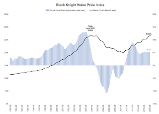
This graph from Black Knight shows the Black Knight HPI.

From Black Knight:
• As of August, we’ve seen 52 consecutive months of year-over-year home price appreciation (HPA)

• The national level HPI is now $266K, the highest median home value seen since 2006 and just 0.7 percent off of the June 2006 peak of $268K

• Annual HPA was 5.3 percent in August, and has remained relatively stable in that range over the last 12 months

• The current rate of annual HPA is above the 19921996 average growth of 2.8 percent, but well below what was seen from 19982005

• Housing supply remains low by historical standards; as of August, there was a 4.6-month supply of homes for sale, down from 5.5, 5.5 and 5.2 months the last three years
Even though nominal prices are close to the previous high in the Black Knight index, real prices (adjusted for inflation) are still around 20% below the price peak in June 2006.

There is much more in the mortgage monitor.

from
http://feedproxy.google.com/~r/CalculatedRisk/~3/jDl9wtFA1wM/black-knight-september-mortgage-monitor.html

Sunday, 6 November 2016

Sunday Night Futures

Weekend:
Schedule for Week of Nov 6, 2016

Monday:
• At 10:00 AM ET, The Fed will release the monthly Labor Market Conditions Index (LMCI).

• At 2:00 PM, the October 2016 Senior Loan Officer Opinion Survey on Bank Lending Practices from the Federal Reserve.

• At 3:00 PM, Consumer credit from the Federal Reserve. The consensus is for a $18.7 billion increase in credit.

From CNBC: Pre-Market Data and Bloomberg futures: S&P futures are up 30 and DOW futures are up 235 (fair value).

Oil prices were down over the last week with WTI futures at $44.59 per barrel and Brent at $45.58 per barrel.  A year ago, WTI was at $44, and Brent was at $46 - so oil prices are basically unchanged year-over-year.

Here is a graph from Gasbuddy.com for nationwide gasoline prices. Nationally prices are at $2.21 per gallon - a year ago prices were also at $2.21 per gallon - so gasoline prices are unchanged year-over-year.

from
http://feedproxy.google.com/~r/CalculatedRisk/~3/FVDO2bEtgPI/sunday-night-futures.html

NAHB: Builder Confidence increases for the 55+ Housing Market in Q3

This is a quarterly index that was released last week by the the National Association of Home Builders (NAHB). This index is similar to the overall housing market index (HMI). The NAHB started this index in Q4 2008 (during the housing bust), so the readings were initially very low

From the NAHB: 55+ Housing Market Has Strong Third Quarter Showing
Builders report that the single-family 55+ housing market is holding strong in the third quarter, according to the National Association of Home Builders' (NAHB) 55+ Housing Market Index (HMI) released today. The index had a reading of 59, up two points from the previous quarter and the 10th consecutive quarter with a reading above 50.

“Builders and developers for the 55+ housing sector tell us that business is solid right now and they expect that trend to continue through the rest of the year,” said Jim Chapman, chairman of NAHB's 55+ Housing Industry Council and president of Jim Chapman Homes LLC in Atlanta.
...
“The 55+ housing market continues on a steady path toward recovery, much like the overall housing market,” said NAHB Chief Economist Robert Dietz. “Older home owners are able to take advantage of low mortgage rates and rising home prices, enabling them to sell their current homes and buy or rent a home in a 55+ community.”
emphasis added
NAHB 55+ Click on graph for larger image.

This graph shows the NAHB 55+ Single Family HMI through Q3 2016.  And reading above 50 indicates that more builders view conditions as good than as  poor.  The index increased to 59 in Q3 up from 57 in Q2.

There are two key drivers in addition to the improved economy: 1) there is a large cohort moving into the 55+ group, and 2) the homeownership rate typically increases for people in the 55 to 70 year old age group. So demographics should be favorable for the 55+ market.

from
http://feedproxy.google.com/~r/CalculatedRisk/~3/he-MVsZPvPU/nahb-builder-confidence-increases-for.html

Saturday, 5 November 2016

Schedule for Week of Nov 6, 2016

This will be a light week for economic data.

The key event will be the US election on Tuesday.

----- Monday, 7th -----

10:00 AM ET: The Fed will release the monthly Labor Market Conditions Index (LMCI).

2:00 PM ET: the October 2016 Senior Loan Officer Opinion Survey on Bank Lending Practices from the Federal Reserve.

3:00 PM: Consumer credit from the Federal Reserve.  The consensus is for a $18.7 billion increase in credit.

----- Tuesday, Nov 8th-----

6:00 AM ET: NFIB Small Business Optimism Index for October.

Job Openings and Labor Turnover Survey10:00 AM: Job Openings and Labor Turnover Survey for September from the BLS.

This graph shows job openings (yellow line), hires (purple), Layoff, Discharges and other (red column), and Quits (light blue column) from the JOLTS.

Jobs openings decreased in August to 5.443 million from 5.831 million in July.

The number of job openings (yellow) were up 3% year-over-year, and Quits were up 4% year-over-year.

All day, U.S. Presidential Election. The forecasts of all key analysts and economists assume Ms. Clinton will be the next President (my forecasts also assume a Clinton presidency). So if Trump is elected, expect some market volatility as forecasts are revised.

----- Wednesday, Nov 9th -----

7:00 AM ET: The Mortgage Bankers Association (MBA) will release the results for the mortgage purchase applications index.

10:00 AM: Monthly Wholesale Trade: Sales and Inventories for July. The consensus is for a 0.2% increase in inventories.

----- Thursday, Nov 10th -----

8:30 AM ET: The initial weekly unemployment claims report will be released.  The consensus is for 263 thousand initial claims, down from 265 thousand the previous week.

----- Friday, Nov 11th -----

10:00 AM: University of Michigan's Consumer sentiment index (preliminary for November). The consensus is for a reading of 87.1, up from 87.2 in October.

from
http://feedproxy.google.com/~r/CalculatedRisk/~3/RgsDgq3QT5c/schedule-for-week-of-nov-6-2016.html

Friday, 4 November 2016

Public and Private Sector Payroll Jobs: Carter, Reagan, Bush, Clinton, Bush, Obama

By request, here is another update of an earlier post through the October 2016 employment report including all revisions.

NOTE: Several readers have asked if I could add a lag to these graphs (obviously a new President has zero impact on employment for the month they are elected). But that would open a debate on the proper length of the lag, so I'll just stick to the beginning of each term.

Note: We frequently use Presidential terms as time markers - we could use Speaker of the House, or any other marker.

Important: There are many differences between these periods. Overall employment was smaller in the '80s, however the participation rate was increasing in the '80s (younger population and women joining the labor force), and the participation rate is generally declining now.  But these graphs give an overview of employment changes.

First, here is a table for private sector jobs. The top two private sector terms were both under President Clinton.  Reagan's 2nd term saw about the same job growth as during Carter's term.  Note: There was a severe recession at the beginning of Reagan's first term (when Volcker raised rates to slow inflation) and a recession near the end of Carter's term (gas prices increased sharply and there was an oil embargo).

Term Private Sector
Jobs Added (000s)
Carter 9,041
Reagan 1 5,360
Reagan 2 9,357
GHW Bush 1,510
Clinton 1 10,884
Clinton 2 10,082
GW Bush 1 -811
GW Bush 2 415
Obama 1 1,921
Obama 2 9,3221
145 months into 2nd term: 9,943 pace.

The first graph shows the change in private sector payroll jobs from when each president took office until the end of their term(s). Presidents Carter and George H.W. Bush only served one term, and President Obama is in the final months of his second term.

Mr. G.W. Bush (red) took office following the bursting of the stock market bubble, and left during the bursting of the housing bubble. Mr. Obama (blue) took office during the financial crisis and great recession. There was also a significant recession in the early '80s right after Mr. Reagan (yellow) took office.

There was a recession towards the end of President G.H.W. Bush (purple) term, and Mr Clinton (light blue) served for eight years without a recession.

Private Sector Payrolls Click on graph for larger image.

The first graph is for private employment only.

The employment recovery during Mr. G.W. Bush's (red) first term was sluggish, and private employment was down 811,000 jobs at the end of his first term.   At the end of Mr. Bush's second term, private employment was collapsing, and there were net 396,000 private sector jobs lost during Mr. Bush's two terms. 

Private sector employment increased slightly under President G.H.W. Bush (purple), with 1,510,000 private sector jobs added.

Private sector employment increased by 20,966,000 under President Clinton (light blue), by 14,717,000 under President Reagan (yellow), and 9,041,000 under President Carter (dashed green).

There were only 1,921,000 more private sector jobs at the end of Mr. Obama's first term.  Forty five months into Mr. Obama's second term, there are now 11,243,000 more private sector jobs than when he initially took office.

Public Sector Payrolls A big difference between the presidencies has been public sector employment.  Note the bumps in public sector employment due to the decennial Census in 1980, 1990, 2000, and 2010. 

The public sector grew during Mr. Carter's term (up 1,304,000), during Mr. Reagan's terms (up 1,414,000), during Mr. G.H.W. Bush's term (up 1,127,000), during Mr. Clinton's terms (up 1,934,000), and during Mr. G.W. Bush's terms (up 1,744,000 jobs).

However the public sector has declined significantly since Mr. Obama took office (down 344,000 jobs). This has been a significant drag on overall employment.

And a table for public sector jobs. Public sector jobs declined the most during Obama's first term, and increased the most during Reagan's 2nd term.

Term Public Sector
Jobs Added (000s)
Carter 1,304
Reagan 1 -24
Reagan 2 1,438
GHW Bush 1,127
Clinton 1 692
Clinton 2 1,242
GW Bush 1 900
GW Bush 2 844
Obama 1 -708
Obama 2 3641
145 months into 2nd term, 388 pace

Looking forward, I expect the economy to continue to expand through the remainder of Mr. Obama's presidency, so I don't expect a sharp decline in private employment as happened at the end of Mr. Bush's 2nd term (In 2005 and 2006 I was warning of a coming down turn due to the bursting of the housing bubble - and I predicted a recession in 2007).

For the public sector, the cutbacks are over.  Right now I'm expecting some further increase in public employment during the last few months of Obama's 2nd term, but obviously nothing like what happened during Reagan's second term.

Below is a table of the top four presidential terms for private job creation (they also happen to be the four best terms for total non-farm job creation).

Clinton's two terms were the best for both private and total non-farm job creation, followed by Reagan's 2nd term.

Currently Obama's 2nd term is on pace to be the 3rd best ever for private job creation.  However, with very few public sector jobs added, Obama's 2nd term is only on pace to be the fifth best for total job creation.

Note: Only 364 thousand public sector jobs have been added during the forty five months of Obama's 2nd term (following a record loss of 708 thousand public sector jobs during Obama's 1st term).  This is about 25% of the public sector jobs added during Reagan's 2nd term!

Top Employment Gains per Presidential Terms (000s)
Rank Term Private Public Total Non-Farm
1 Clinton 1 10,884 692 11,576
2 Clinton 2 10,082 1,242 11,312
3 Reagan 2 9,357 1,438 10,795
4 Carter 9,041 1,304 10,345
5 Obama 21 9,322 364 9,686
  Pace2 9,943 388 10,332
145 Months into 2nd Term
2Current Pace for Obama's 2nd Term

The last table shows the jobs needed per month for Obama's 2nd term to be in the top four presidential terms. Right now it looks like Obama's 2nd term will be the 3rd best for private employment (behind Clinton's two terms, and ahead of Reagan) and probably 4th or 5th for total employment.

Average Jobs needed per month (000s)
for remainder of Obama's 2nd Term
to Rank Private Total
#1 521 630
#2 253 546
#3 12 370
#4 -94 220


from
http://feedproxy.google.com/~r/CalculatedRisk/~3/xvCQ4rxCthM/public-and-private-sector-payroll-jobs.html

Trade Deficit at $36.4 Billion in October

Earlier from the Department of Commerce reported:
The U.S. Census Bureau and the U.S. Bureau of Economic Analysis, through the Department of Commerce, announced today that the goods and services deficit was $36.4 billion in September, down $4.0 billion from $40.5 billion in August, revised. September exports were $189.2 billion, $1.0 billion more than August exports. September imports were $225.6 billion, $3.0 billion less than August imports.
The trade deficit was larger than the consensus forecast of $38.9 billion (expect a small upward revision to Q3 GDP).

The first graph shows the monthly U.S. exports and imports in dollars through September 2016.

U.S. Trade Exports Imports Click on graph for larger image.

Imports decreased and exports increased in September.

Exports are 14% above the pre-recession peak and up 1% compared to September 2015; imports are down 1% compared to September 2015. 

It appears trade might be picking up a little.

The second graph shows the U.S. trade deficit, with and without petroleum.

U.S. Trade Deficit The blue line is the total deficit, and the black line is the petroleum deficit, and the red line is the trade deficit ex-petroleum products.

Oil imports averaged $39.02 in September, down from $39.38 in August, and down from $42.72 in September 2015.  The petroleum deficit has generally been declining and is the major reason the overall deficit has declined a little since early 2012.

The trade deficit with China decreased to $32.4 billion in September, from $36.3 billion in September 2015. The deficit with China is a substantial portion of the overall deficit, but the deficit with China has been declining.

from
http://feedproxy.google.com/~r/CalculatedRisk/~3/63OVt9dRnoU/trade-deficit-at-364-billion-in-october.html

Comments: Solid October Employment Report, Pickup in Wage Growth

The headline jobs number was decent. Job growth was somewhat below the consensus forecast (161,000 vs forecast of 170,000), however job growth for August and September were revised up - and the unemployment rate ticked down to 4.9%.

Earlier: October Employment Report: 161,000 Jobs, 4.9% Unemployment Rate

Job growth has averaged 181,000 per month this year.

In October, the year-over-year change was 2.36 million jobs - a solid gain.

Average Hourly Earnings

Wages CES, Nominal and RealClick on graph for larger image.

This graph is based on “Average Hourly Earnings” from the Current Employment Statistics (CES) (aka "Establishment") monthly employment report. Note: There are also two quarterly sources for earnings data: 1) “Hourly Compensation,” from the BLS’s Productivity and Costs; and 2) the Employment Cost Index which includes wage/salary and benefit compensation.

The graph shows the nominal year-over-year change in "Average Hourly Earnings" for all private employees.  Nominal wage growth was at 2.8% YoY in October.  This series is noisy, however overall wage growth is trending up - especially over the last year and a half.

Note: CPI has been running around 2%, so there has been real wage growth.

Seasonal Retail Hiring

According to the BLS employment report, retailers hired seasonal workers in October at a lower pace than the last two years.

Seasonal Retail HiringTypically retail companies start hiring for the holiday season in October, and really increase hiring in November. Here is a graph that shows the historical net retail jobs added for October, November and December by year.

This graph really shows the collapse in retail hiring in 2008. Since then seasonal hiring has increased back close to more normal levels. Note: I expect the long term trend will be down with more and more internet holiday shopping.

Retailers hired 155 thousand workers (NSA) net in October.   Note: this is NSA (Not Seasonally Adjusted).

This suggests retailers are a little cautious about the holiday season.  Note: There is a decent correlation between October seasonal retail hiring and holiday retail sales.

Employment-Population Ratio, 25 to 54 years old

Employment Population Ratio, 25 to 54Since the overall participation rate has declined recently due to cyclical (recession) and demographic (aging population, younger people staying in school) reasons, here is the employment-population ratio for the key working age group: 25 to 54 years old.

In the earlier period the participation rate for this group was trending up as women joined the labor force. Since the early '90s, the participation rate moved more sideways, with a downward drift starting around '00 - and with ups and downs related to the business cycle.

The 25 to 54 participation rate increased in October to 81.6%, and the 25 to 54 employment population ratio increased to 78.2%.

The participation rate has been trending down for this group since the late '90s, however, with more younger workers (and fewer older workers), the participation rate might move up some more.

Part Time for Economic Reasons

Part Time WorkersFrom the BLS report:
The number of persons employed part time for economic reasons (also referred to as involuntary part-time workers) was unchanged in October at 5.9 million. These individuals, who would have preferred full-time employment, were working part time because their hours had been cut back or because they were unable to find a full-time job.
The number of persons working part time for economic reasons was essentially unchanged in October. This level suggests slack still in the labor market.

These workers are included in the alternate measure of labor underutilization (U-6) that declined to 9.5% in October. This is the lowest level for U-6 since May 2008.

Unemployed over 26 Weeks

Unemployed Over 26 WeeksThis graph shows the number of workers unemployed for 27 weeks or more.

According to the BLS, there are 1.979 million workers who have been unemployed for more than 26 weeks and still want a job. This was up slightly from 1.974 million in September.

This is generally trending down, but is still high.

There are still signs of slack (as example, elevated level of part time workers for economic reasons and U-6), but there also signs the labor market is tightening.

Overall this was another solid report.

from
http://feedproxy.google.com/~r/CalculatedRisk/~3/6GWt3FmRJNE/comments-solid-october-employment.html

October Employment Report: 161,000 Jobs, 4.9% Unemployment Rate

From the BLS:
Total nonfarm payroll employment rose by 161,000 in October, and the unemployment rate was little changed at 4.9 percent, the U.S. Bureau of Labor Statistics reported today. Employment continued to trend up in health care, professional and business services, and financial activities.
...
The change in total nonfarm payroll employment for August was revised up from +167,000 to +176,000, and the change for September was revised up from +156,000 to +191,000. With these revisions, employment gains in August and September combined were 44,000 more than previously reported.
...
In October, average hourly earnings for all employees on private nonfarm payrolls rose by 10 cents to $25.92, following an 8-cent increase in September. Over the year, average hourly earnings have risen by 2.8 percent.
emphasis added
Payroll jobs added per monthClick on graph for larger image.

The first graph shows the monthly change in payroll jobs, ex-Census (meaning the impact of the decennial Census temporary hires and layoffs is removed - mostly in 2010 - to show the underlying payroll changes).

Total payrolls increased by 161 thousand in October (private payrolls increased 142 thousand).

Payrolls for August and September were revised up by a combined 44 thousand.

Year-over-year change employmentThis graph shows the year-over-year change in total non-farm employment since 1968.

In October, the year-over-year change was 2.36 million jobs.  A solid gain.


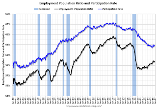
The third graph shows the employment population ratio and the participation rate.

Employment Pop Ratio, participation and unemployment ratesThe Labor Force Participation Rate decreased in September to 62.8%. This is the percentage of the working age population in the labor force.   A large portion of the recent decline in the participation rate is due to demographics.

The Employment-Population ratio decreased to 59.7% (black line).

I'll post the 25 to 54 age group employment-population ratio graph later.

unemployment rateThe fourth graph shows the unemployment rate.

The unemployment rate decreased in October to 4.9%.

This was slightly below expectations of 170,000 jobs, however job growth for August and September were revised up - and there was solid wage growth. A solid report.

I'll have much more later ...

from
http://feedproxy.google.com/~r/CalculatedRisk/~3/9n7QTuCqowM/october-employment-report-161000-jobs.html

Thursday, 3 November 2016

Friday: Employment Report, Trade Deficit

From Matthew Graham at Mortgage News Daily: Mortgage Rates Drift Higher Ahead of Jobs Report
Mortgage Rates were slightly higher today, keeping them in line with the weakest levels in just over 5 months. "Weakness" is relative, however. Apart from the past 5 months, and a few months in 2012, today's rates would rank among all-time lows. Day-to-day movement hasn't been extreme for the past few days, with most lenders continuing to quote 3.625% on top tier conventional 30yr fixed scenarios, and merely making small adjustments to the upfront costs depending on market movement.
emphasis added
Friday:
• At 8:30 AM ET, Employment Report for October. The consensus is for an increase of 178,000 non-farm payroll jobs added in October, up from the 156,000 non-farm payroll jobs added in September. The consensus is for the unemployment rate to decline to 4.9%.

• Also at 8:30 AM, Trade Balance report for September from the Census Bureau. The consensus is for the U.S. trade deficit to be at $38.9 billion in September from $40.7 billion in August.

from
http://feedproxy.google.com/~r/CalculatedRisk/~3/xtQ_wyVQK4w/friday-employment-report-trade-deficit.html

October Employment Preview

On Friday at 8:30 AM ET, the BLS will release the employment report for October. The consensus, according to Bloomberg, is for an increase of 178,000 non-farm payroll jobs in October (with a range of estimates between 155,000 to 200,000), and for the unemployment rate to decrease to 4.9%.

The BLS reported 156,000 jobs added in September.

Here are a few excerpts from Goldman Sachs' October Payroll Preview by economists Elad Pashtan and Zach Pandl:
We forecast an increase of 185k in nonfarm payroll employment for October, slightly above consensus expectations. An expected rebound in employment growth for state and local governments, as well as education- and health care-related industries, is a key reason for the acceleration from a 156k gain in payrolls in September.

We look for a decline in the unemployment rate to 4.9%, which is now unusually high compared with continuing jobless claims. Favorable calendar effects as well as strengthening underlying wage tends likely boosted average hourly earnings by 0.3% month-over-month.
emphasis added
Here is a summary of recent data:

• The ADP employment report showed an increase of 147,000 private sector payroll jobs in October. This was below expectations of 170,000 private sector payroll jobs added. The ADP report hasn't been very useful in predicting the BLS report for any one month, but in general, this suggests employment growth somewhat below expectations.

• The ISM manufacturing employment index increased in October to 52.9%. A historical correlation between the ISM manufacturing employment index and the BLS employment report for manufacturing, suggests that private sector BLS manufacturing payroll decreased slightly in October. The ADP report indicated 1,000 manufacturing jobs lost in October.

The ISM non-manufacturing employment index decreased in October to 53.1%. A historical correlation between the ISM non-manufacturing employment index and the BLS employment report for non-manufacturing, suggests that private sector BLS non-manufacturing payroll jobs increased about 156,000 in October.

Combined, the ISM indexes suggests employment gains of about 155,000.  This suggests employment growth somewhat below expectations.

Initial weekly unemployment claims averaged 258,000 in October, up from 256,000 in September. For the BLS reference week (includes the 12th of the month), initial claims were at 252,000, up from 251,000 during the reference week in August.

The slight increase during the reference suggests about the same level of labor stress in October as in September.  This suggests another positive employment report.

• The final October University of Michigan consumer sentiment index decreased to 87.2 from the September reading of 91.2. Sentiment is frequently coincident with changes in the labor market, but there are other factors too like gasoline prices and possibly politics.

• Conclusion: Unfortunately none of the indicators alone is very good at predicting the initial BLS employment report. The ADP and the ISM reports suggest weaker job growth.  And it is possible Hurricane Matthew negatively impacted employment in a few states.

My guess is the October report will be below the consensus forecast.

from
http://feedproxy.google.com/~r/CalculatedRisk/~3/r5XPR3LsZ_o/october-employment-preview.html

Fannie and Freddie: REO inventory declined in Q3, Down 31% Year-over-year

Fannie and Freddie reported results this week. Here is some information on Real Estate Owned (REOs).

Freddie Mac reported the number of REO declined to 12,185 at the end of Q3 2106 compared to 17,780 at the end of Q3 2015.

For Freddie, this is down 84% from the 74,897 peak number of REOs in Q3 2010. For Freddie, this is the lowest since at least 2007.

Fannie Mae reported the number of REO declined to 41,973 at the end of Q3 2016 compared to 60,958 at the end of Q3 2015.

For Fannie, this is down 75% from the 166,787 peak number of REOs in Q3 2010. For Fannie, this is the lowest since Q4 2007.

Fannie and Freddie REO Click on graph for larger image.

Here is a graph of Fannie and Freddie Real Estate Owned (REO).

REO inventory decreased in Q3 for both Fannie and Freddie, and combined inventory is down 31% year-over-year.

Delinquencies are falling, but there are still a number of properties in the foreclosure process with long time lines in judicial foreclosure states - but this is getting close to normal levels of REOs.

from
http://feedproxy.google.com/~r/CalculatedRisk/~3/ffLrMMA3Uww/fannie-and-freddie-reo-inventory.html

Trend Alert! 5 Reasons To Move To An “Agrihood”

When Stephanie Walsh and her husband were looking to buy a home in Atlanta, GA, they had a pretty unusual set of qualifications for their new home: They wanted to have access to local, organic produce (and not just from the grocery store); they wanted a neighborhood that was easily walkable; and they wanted to […]

The post Trend Alert! 5 Reasons To Move To An “Agrihood” appeared first on Trulia's Blog.


from
https://www.trulia.com/blog/agricultural-communities-agrihood-trend/

ISM Non-Manufacturing Index declined to 54.8% in October

The September ISM Non-manufacturing index was at 54.8%, down from 57.1% in September. The employment index decreased in October to 53.1%, from 57.2%. Note: Above 50 indicates expansion, below 50 contraction.

From the Institute for Supply Management:October 2016 Non-Manufacturing ISM Report On Business®
Economic activity in the non-manufacturing sector grew in October for the 81st consecutive month, say the nation's purchasing and supply executives in the latest Non-Manufacturing ISM® Report On Business®.

The report was issued today by Anthony Nieves, CPSM, C.P.M., CFPM, chair of the Institute for Supply Management® (ISM®) Non-Manufacturing Business Survey Committee. "The NMI® registered 54.8 percent in October, 2.3 percentage points lower than the September reading of 57.1 percent. This represents continued growth in the non-manufacturing sector at a slower rate. The Non-Manufacturing Business Activity Index decreased to 57.7 percent, 2.6 percentage points lower than the September reading of 60.3 percent, reflecting growth for the 87th consecutive month, at a slower rate in October. The New Orders Index registered 57.7 percent, 2.3 percentage points lower than the reading of 60 percent in September. The Employment Index decreased 4.1 percentage points in October to 53.1 percent from the September reading of 57.2 percent. The Prices Index increased 2.6 percentage points from the September reading of 54 percent to 56.6 percent, indicating prices increased in October for the seventh consecutive month. According to the NMI®, 13 non-manufacturing industries reported growth in October. There has been a slight cooling-off in the non-manufacturing sector month-over-month, indicating that last month’s increases weren’t sustainable. Respondent’s comments remain mostly positive about business conditions and the overall economy. Several comments were made about the uncertainty on the impact of the upcoming U.S. presidential election."
emphasis added
ISM Non-Manufacturing Index Click on graph for larger image.

This graph shows the ISM non-manufacturing index (started in January 2008) and the ISM non-manufacturing employment diffusion index.

This was below the consensus forecast of 56.1, and suggests slower expansion in October than in September.

from
http://feedproxy.google.com/~r/CalculatedRisk/~3/HfEluxVEMBA/ism-non-manufacturing-index-declined-to.html

Weekly Initial Unemployment Claims increase to 265,000

The DOL reported:
In the week ending October 29, the advance figure for seasonally adjusted initial claims was 265,000, an increase of 7,000 from the previous week's unrevised level of 258,000. The 4-week moving average was 257,750, an increase of 4,750 from the previous week's unrevised average of 253,000.

There were no special factors impacting this week's initial claims. This marks 87 consecutive weeks of initial claims below 300,000, the longest streak since 1970.
The previous week was unrevised.

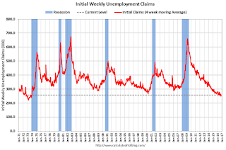
The following graph shows the 4-week moving average of weekly claims since 1971.

Click on graph for larger image.


The dashed line on the graph is the current 4-week average. The four-week average of weekly unemployment claims increased to 257,750.

This was above the consensus forecast. The low level of claims suggests relatively few layoffs.

from
http://feedproxy.google.com/~r/CalculatedRisk/~3/WgBXxlIFj5k/weekly-initial-unemployment-claims.html